domingo, 6 de marzo de 2011

PENNANTS

Continuation patterns abound, and pennants represent yet another one of them. Like triangles and flags, pennants indicate that the prevailing trend, up or down, is likely to continue. Thus, binary option traders who see a pennant should position themselves with options that will be in the money when the previous trend resumes.
Pennants are often confused with flags, triangles, and wedges. They differ from flags and triangles in that the price action in a pennant is contained within two converging trendlines, neither of which is perfectly horizontal. Recall that the trendlines of a flag are parallel, and each type of triangle contains at least one trendline that is perfectly horizontal. Pennants differ from wedges in that they are continuation patterns, whereas wedges are reversal patterns. Also unlike a wedge, which slopes in a particular direction, the overall direction of the price action in a pennant is horizontal even though the trendlines converge.
A pennant is in fact a price channel that gets continually narrower. Like a price channel, it is a consolidation pattern that tends to occur as traders rest. The signal to trade on a pennant pattern comes when price breaks out of the converging trendlines in the direction of the prevailing trend and is accompanied by a spike in volume.
Binary option traders looking to profit from pennant patterns should buy Call-style options when a pennant has formed during an uptrend, and a breakout with volume occurs to the upside. Similarly, they should buy Put-style options when a pennant has formed during a downtrend, and a breakout with volume occurs to the downside. It is possible to use the converging trendlines to design profitable range-style trades that reward traders when price stays confined to a certain range. Traders who do that just need to be ready to reverse their positions quickly in the event of a breakout.
FLAGS

Flags represent another pattern that indicates the continuation of a market’s prevailing price trend. They can occur during uptrends and downtrends, and though they slope in the opposite direction of the trend, they tend to indicate that the trend will continue. When a flag has formed, binary option traders should watch carefully for a breakout in the opposite direction of the slope of the flag. When this occurs, they should position themselves with appropriately.
Flags are very similar to, and often confused with, other continuation patterns like triangles and pennants. The differences among these patterns are in the subtleties of their shapes. A flag is formed when price begins trading in a counter-trend direction and the new price pattern stays within the boundaries of two parallel trendlines. Note that if the trendlines converge, the pattern is not a flag but a wedge, which is a reversal pattern.
A flag that forms during an uptrend will have a downward slope. The signal that the prevailing trend is reasserting itself occurs when the top trendline, or resistance line, of the flag is broken by price with an accompanying spike in volume. Astute binary option traders can take this as a signal to buy Call-style options that will be in the money at higher prices.
A flag that forms during a downtrend will have an upward slope. The signal that the prevailing trend is reasserting itself occurs when the bottom trendline, or support line, of the flag is broken by price with an accompanying spike in volume. This signal indicates that Put-style binary options can be profitably traded at this time.
Flags are one of the most common continuation patterns, and their breakout signals are considered to be quite dependable. Only rarely will the two trendlines of a flag be perfectly parallel, so traders will need to use their discretion when deciding if a pattern is a flag or a wedge. Experience will be the best teacher in this situation.

WEDGES

A wedge is a unique reversal pattern that indicates a directional change from the trend contained within the pattern itself. Wedges are formed when price stays within two converging trendlines that slope in the same up or down direction. While the wedge holds, the upper trendline acts as resistance and the lower trendline acts as support. Binary option traders who see a wedge pattern forming should prepare trades that will allow them to profit from a move in the opposite direction of the trend within the wedge.
Rising wedges form around internal uptrends. Both the support and resistance lines that can be drawn around a rising wedge will be sloped in the direction of increasing price. As the two lines converge, price is expected to break out of the wedge to the downside, so binary option traders who see a rising wedge should put their money into Put-style options that require price to fall to be in-the-money.
Falling wedges are the opposite of rising wedges in that they form around internal downtrends. The support and resistance lines that border price in a falling wedge slope in the downward direction, and as they converge price is expected to break out of the patttern to the upside. Binary option traders who observe a falling wedge in progress should position themselves with Call-style options that require price to rise to be in-the-money.
Wedges should not be confused with triangles. Though similar in shape to wedges, triangles are continuation patterns that indicate a breakout move in the same direction as the previous trend, whereas wedges indicate a reversal of the present trend. Wedges are more commonly encountered then triangles because rarely does the perfectly horizontal support or resistance line required for a triangle form around the price data on a chart.

SCALES: ARITHMETIC VS LOGARITHMIC

The purpose of a price chart is to show how the price of an asset changes over time. The typical price chart—whether it represents a stock, commodity, currency-pair, or index—has time on its x-axis and price on its y-axis. Time plods forward at a predictable and linear rate, so the x-axis is always the same—it is divided into equal time intervals or periods. Price, however, is not so predictable and linear. Some asset’s prices stay stable for long periods of time, but others jump around wildly, and sometimes even increase or decrease exponentially. It is for this reason that some price charts use an arithmetic scale and some use a logarithmic scale.
An arithmetic scale is the most common type of scaling on graphs. When price is scaled arithmetically on a chart, each increment of price is given the same space on the axis. For example, an arithmetic chart might have ten tick-marks spaced evenly along the price axis, with each tick-mark representing an increase of 1 USD over the last. This type of scaling is best for charting asset prices that stay in a fairly small range and do not tend to make huge jumps between time intervals.
An arithmetic scale cannot be used in all cases. Imagine a stock that trades between 10 and 20 USD for six months, then leaps to the 500 USD to 600 USD range for the next six months. Using an arithmetic scale to chart that whole year would squish the data from the first six months—when it traded between 10 and 20 USD—into an unreadably small vertical space. Either that, or the y-axis would have to be so tall to accommodate both ranges equally that the chart would have an impractical size. This is where a logarithmic scale comes into play.
A logarithmic scale is used on the price axis when asset’s price has experienced an enormous variation, from tens of dollars to hundreds of dollars to thousands of dollars. On a logarithmic price axis, each evenly spaced tick-mark represents the next multiple of ten. For instance, imagine a logarithmic chart with five tick-marks spaced one inch apart up the whole axis. The first tick-mark would be the 1 USD mark, the next one would be the 10 USD mark, then the 100 USD mark, then 1,000 USD, and finally 10,000 USD. The smaller sections between tick-marks are spaced unevenly, with the lower values given larger vertical space. The overall design of the logarithmic price axis means that asset prices over a large period can be comfortably shown on one chart no matter how extreme their range.

OPEN INTEREST

Open interest refers to the number of unsettled asset contracts that exist for a given market. For example, open interest for a standard option contract is the number of contracts that have been sold; if 40 Calls for Microsoft stock have been sold for the 30 USD strike price, then traders would say that those Calls have an open interest of 40. The open interest in Puts is equal to however many of Puts that have been sold.
Traders use open interest to try to gauge investor sentiment by looking at what is called the Put/Call ratio. If the open interest in Puts is greater than the open interest in Calls for a particular company’s stock, then the Put/Call ratio will be greater than 1, which signals that most traders and investors think the stock price will fall. If the open interest in Calls is greater, the Put/Call ratio will be less than 1, which is a bullish sign for the stock price. Market contrarians use Put/Call ratios in the opposite way, because they assume that the majority of people are usually wrong about the markets. Since binary option traders generally engage in short-term trading, the Put/Call ratio is of limited use but can still be interesting to look at for a short-term play just before a company’s earnings announcement.
Many traders examine open interest to try to identify insider information. If a Put or Call option with a seemingly random time of expiration and strike price has an unusually high open interest, and all of the other options for the same stock have relatively low open interests, there might be something going on; most traders would say that someone with insider information is stock-piling the contract with the high open interest and that following suit would be a good and profitable idea.

VOLUME

Volume is an important indicator that most traders like to add to their price charts. It reflects the number of shares or contracts of an asset that has been traded in a specified time interval. Most price charts with volume display it below the price data in the form of a histogram, with taller columns representing more shares or contracts traded. Some trading programs even allow traders to build charts where candles or bars represent increments of volume instead of time. Binary option traders should play close attention to volume because it can give important clues for short-term moves.
Stock and futures traders—or binary option traders that trade options with stocks or futures as underlying assets—pay particularly close attention to volume. Since stocks and futures are traded through central exchanges, it is easy to track the number of shares or contracts that have been traded during a period of time. The central exchanges distribute the volume data to the trading platforms of investors and traders. Most traders watch for periods of increasing or decreasing volume to help predict short-term price action. Typically, a period of increasing volume that culminates in a volume spike followed by a sharp drop is considered to signify the end of a market move.
Forex traders do not have the benefit of central exchanges that track the volume of currency-pairs as they are traded. Sometimes large brokers can provide local volume data, but it is not considered to be nearly as meaningful as the data provided for stocks and futures by their central exchanges. Traders who enjoy trading forex products and would like to use volume in their trading should consider trading currency futures instead. The price action is the same and volume data is readily available.

LINE CHARTS


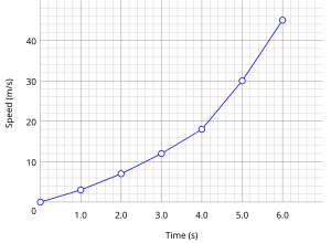
Simple example of a physical science graph of ...
Sample Line Chart
A line chart is the simplest type of chart used to display price data. Line charts are popular because they are easy to read, but they do have limitations that all traders should be aware of. Time or volume—most often time—is on the x-axis of a line chart, and asset price is on the y-axis. The price data is represented by a simple line drawn from left to right. To determine an asset’s price at a given time, a trader simply locates the time of interest on the x-axis, then looks at the price line directly above that time.
Line charts have their limitations. Forming that nice, clean line requires connecting a series of simple, one-dimensional points, where each point represents the asset’s price at a given time. The distance between two points is a time interval during which the asset’s price may have fluctuated significantly. A line chart does not show these fluctuations between points; instead, it assumes that the price transitions smoothly from one point to the next. Other charts, like bar and candlestick charts, do show these fluctuations because bars and candlesticks are built using four distinct prices for each time interval—the high, low, open, and close (HLOC).
Traders who elect to use line charts should be aware of the prices they are being shown. If they choose to use a line chart based on 5-minute time intervals, they should know whether each point in the line shows the high, low, open, or close price during that interval. For instance, a 5-minute stock chart built on opening prices for each time interval will not show the correct closing price for the day, because the line will end not at the end of the last minute of the trading day, but at the beginning of the last 5-minute interval.
Since they are so easy to read, line charts are great for anyone interested in studying the general behavior of a market. Long-term investors will find line charts adequate because their market activities often do not require a high degree of precision. Short-term investors or traders—a group that includes most binary option traders—will prefer bar or candlestick charts because short-term market decisions require higher data resolution for greater overall precision.